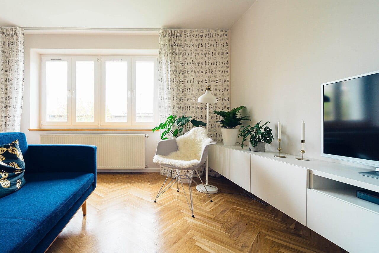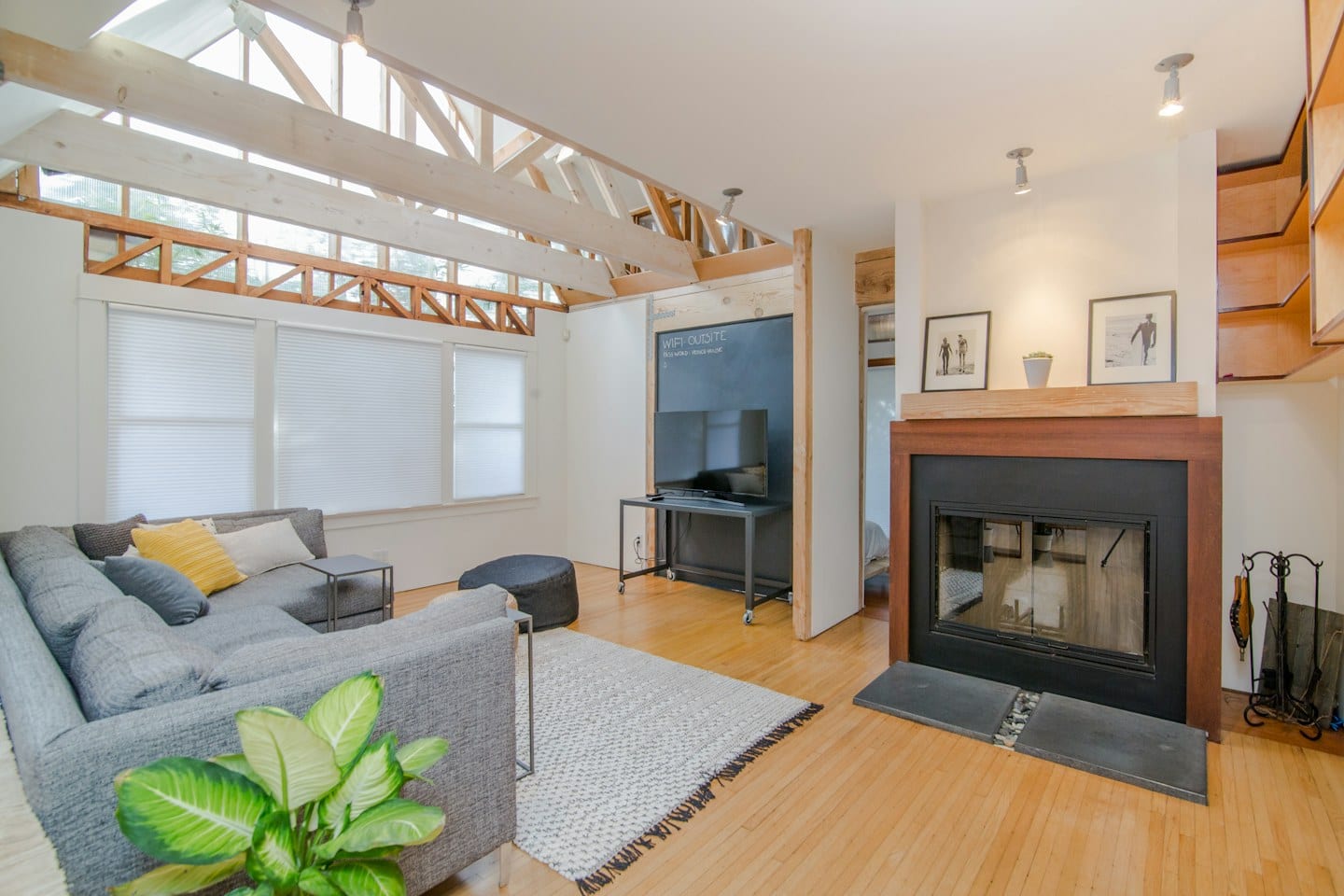
A small square of color on a white card rarely tells the full story once it meets a living room wall. When you move from a swatch to a surface, the light, the shadows, and the surrounding furniture transform that single shade into something entirely new. This becomes a complex logistical puzzle when you are trying to maintain a consistent aesthetic across two different households.
Managing the Dual-Household Palette
Coordinating a design vision between two separate residences requires more than just keeping a digital photo of a color chip on your phone. If you are managing decor for both a primary residence and a secondary home, the risk of visual drift is high. A shade that feels warm and inviting in a bright, north-facing room in one house might appear muddy or cold in a darker, south-facing space in another.
To prevent this, your first step is to create a physical system of identification. Instead of relying on memory or vague descriptions, use a permanent marker to label every sample. Include the specific name, the brand, and the date you collected it. If you are working with a designer or a specialist, ask how they recommend organizing these physical samples to ensure they remain distinct during the decision-making process.
The Importance of Localized Observation
A color cannot be judged in a vacuum. To see how a shade truly behaves, you must observe it in the exact environment where it will live. This means placing your labeled samples directly on the walls of the target rooms, rather than holding them up against a white backdrop or viewing them under the harsh glare of a kitchen light.
For example, if you are attempting to match the soft greige of a living room in one house to a guest suite in another, you might find that the samples look identical at noon but diverge wildly at sunset. For instance, imagine you have selected three potential shades for a shared color scheme. In the morning, they all appear nearly white, but as the sun dips and the interior lamps turn on, one sample might suddenly take on a heavy yellow undertone that clashes with your existing upholstery.
Testing Through Daily Routines
The most reliable way to confirm a choice is to observe the sample through the natural rhythm of your day. A room is not a static museum; it is a place of changing light and shifting moods. Dedicate time to looking at your labeled swatches during different periods: the bright clarity of mid-morning, the flat light of a cloudy afternoon, and the artificial glow of evening.
As you evaluate these changes, consider the tradeoff between a color that looks striking in a single moment and one that remains steady throughout the day. Ask yourself if the shift in tone during evening hours aligns with how you actually use the space. Once you have observed the samples across these various intervals and confirmed they work in both environments, you can move forward with confidence in your selection.